
This LARA logo embodies hope and progress for a transitional housing program for individuals in recovery. Featuring a welcoming house crowned with a sun, it symbolizes the journey to independence and the miracle of transformation. The bold sans-serif font reinforces clarity. The golden hue evokes wealth, emphasizing the abundance of possibilities in recovery. It is one color only which will translate well on all applications and print at a low cost.

I designed this logo for an extracurricular endeavor of Capitol Supply & Service and used a bold, two-part textual approach in a black and white color scheme. The gray vector design is inspired by a strip of duct tape and the distressed font for “SALVAGE” is hand-written and scanned. The goal of this logo was to convey clean and modern typography mixed with the rugged nature of the slightly used and damaged products offered.
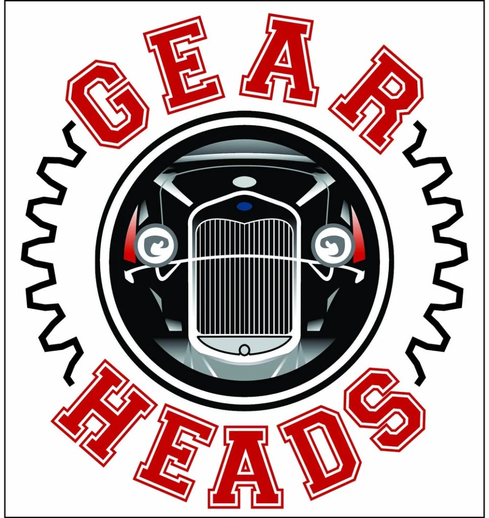
The “Gear Heads” logo I designed is inspired by vintage classic cars and retro team aesthetics. I chose the font in “GEAR” and “HEADS” with a thick red outline to be reminiscent of classic signage or car branding and chose a circular design to compose an iconic emblem.
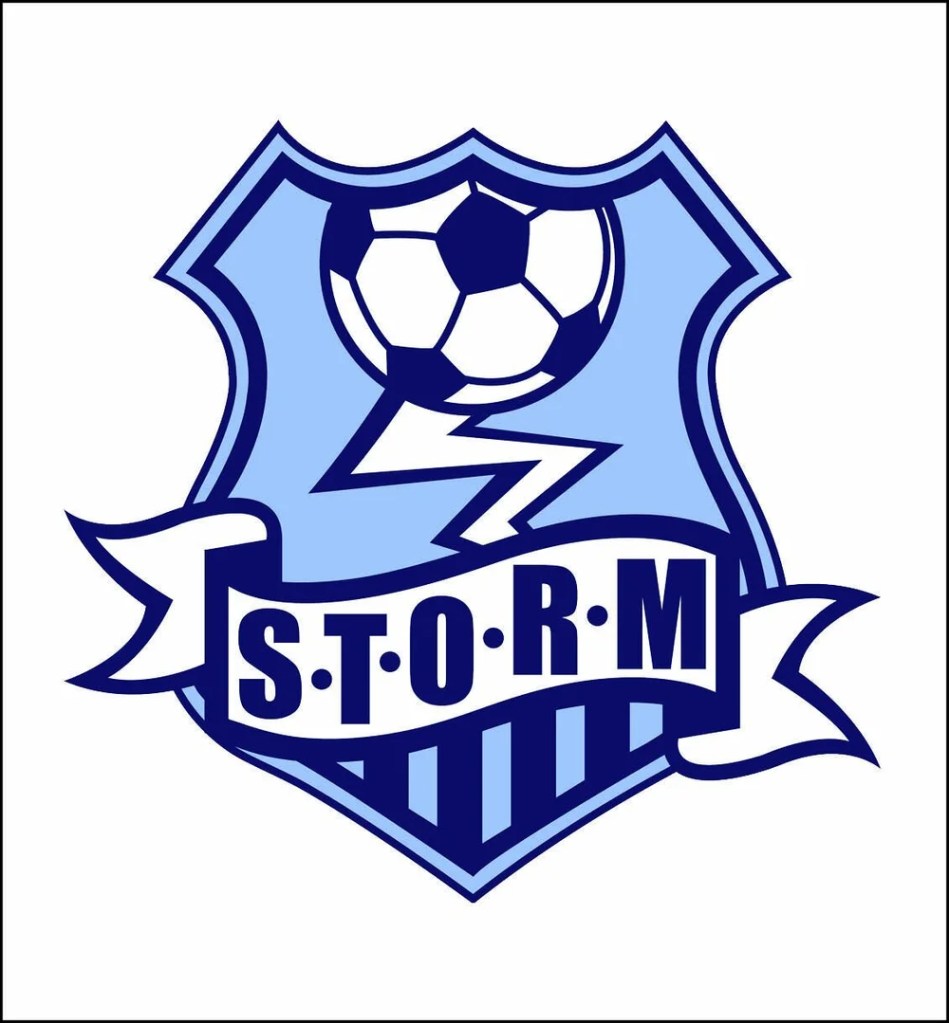
The STORM soccer team logo I designed in a bold, athletic graphic design style typical of sports team branding. I chose a shield as the primary structure which is a common shape for soccer team logos. The image of the lightning bolt ties into the “STORM” name to convey action and strength. The colors and shapes are simple and high contrasting which would make the logo’s application easy across multiple forms of media.
In designing The Grosse Ile Evening Garden Club logo, I balanced traditional elements with modern ones using contrasting fonts and bold colors while incorporating simple graphics pertaining to nature. I chose the ladybug on a leaf integrated into the “g” in “evening” to add visual interest and color balance. The name and stylization of the leaf and ladybug both communicate the purpose of the club.
